
For many people, the first association is Christmas. Bright holly green beside vivid Santa red has such a strong seasonal identity that homeowners sometimes avoid the combination completely outside December. Yet interior designers have been pairing versions of red and green for generations. Burgundy with olive, terracotta with sage, oxblood with forest green, dusty rose with eucalyptus, and brick red with moss all create rooms that feel sophisticated rather than festive.
The difference is in the shade, proportion, furniture, materials, and surrounding neutral colors.
A bedroom also presents a special challenge. Unlike a hallway or dining room, it needs to feel comfortable enough for rest. Filling every surface with highly saturated red and green can create too much visual energy. A more thoughtful room gives one color a leading role while allowing the other to appear through furniture, textiles, artwork, or smaller accents.
Furniture is especially useful here. A green upholstered bed, red-painted cabinet, walnut bedside table, or pair of restrained nightstands can establish the palette without requiring you to repaint the entire bedroom.
This guide explains how to build a red and green bedroom from the furniture outward, choose shades that actually work together, avoid the Christmas effect, and create a room that still feels comfortable years after the first redesign.
Why Do Red and Green Work Together?
Red and green sit opposite one another on the traditional color wheel. This makes them complementary colors.
Complementary colors naturally create contrast. Put a deep red object against green and each color tends to appear more noticeable. That explains why the pairing can feel dramatic even when only a modest amount of each color is present.
The principle sounds simple, but a successful bedroom depends on more than color-wheel theory.
Pure red and pure green produce an intense contrast. Muted versions behave very differently.
Consider these combinations:
| Red family | Green family | Overall feeling | Best bedroom style |
|---|---|---|---|
| Burgundy | Forest green | Rich and dramatic | Traditional, luxury |
| Terracotta | Sage | Warm and relaxed | Mediterranean, organic |
| Brick red | Olive | Earthy and mature | Rustic, vintage |
| Dusty rose | Eucalyptus | Soft and calm | Contemporary, romantic |
| Oxblood | Deep emerald | Luxurious | Art Deco, maximalist |
| Rust | Moss | Natural and warm | Bohemian, eclectic |
| Coral red | Muted mint | Fresh and playful | Retro, youthful |
| Wine red | Hunter green | Formal and classic | Heritage interiors |
The key lesson is straightforward: red and green are not single colors.
Changing their undertones changes the entire room.
The Fast Answer: How Should You Decorate a Red and Green Bedroom?
For most bedrooms, choose muted or deep versions of red and green rather than using equally bright primary shades. Let one color dominate, use the second as an accent, and introduce warm neutrals or natural wood between them.
A reliable starting formula is:
- 60% neutral or dominant background color
- 30% secondary color
- 10% stronger accent color
This isn’t a law. Rooms aren’t mathematical equations. Think of it as a useful safeguard when you aren’t sure how much color to introduce.
For example, a bedroom could have warm off-white walls, an olive upholstered bed, walnut furniture, and burgundy cushions. Another could reverse the relationship with muted red walls, cream bedding, and dark green bedside furniture.
Both qualify as red and green rooms without looking remotely like Christmas displays.
Start With the Bedroom Furniture, Not the Accessories
One common decorating mistake is buying cushions, lamps, throws, and wall art before deciding what the largest furniture pieces will look like.
That often creates a room full of disconnected accents.
Instead, identify the visually dominant pieces first:
- Bed
- Headboard
- Wardrobe or armoire
- Dresser
- Bedside furniture
- Bench or chair
These items establish scale, texture, and visual weight.
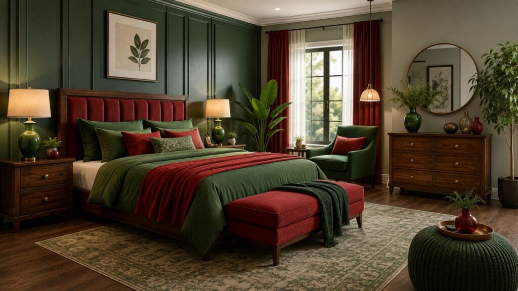
If your bed has a dramatic forest-green velvet headboard, you may need surprisingly little additional green. Burgundy pillows and a faded red rug could be enough to establish the complementary relationship.
If the bed is neutral, furniture around it has more work to do.
A slim red night stand, for example, can become a deliberate accent beside a cream bed. A wooden nightstand with drawers can instead act as a visual pause between a red wall and green bedding.
That distinction matters. Furniture doesn’t always need to carry one of your main colors. Sometimes its most valuable role is separating them.
Choosing the Right Red for a Bedroom
Red is visually powerful. Large amounts of bright red can make a bedroom feel energetic, theatrical, or intense, which isn’t always desirable in a space associated with rest.
That doesn’t mean red walls are forbidden.
It means shade selection matters.
Burgundy
Burgundy contains enough depth to behave almost like a dark neutral in the right setting. It pairs especially well with:
- forest green
- hunter green
- antique brass
- walnut
- cream
- warm white
A burgundy upholstered headboard against a warm cream wall can feel far quieter than a bright scarlet headboard.
Brick Red
Brick red contains earthy brown and orange undertones. It works naturally with olive, moss, sage, oak, terracotta pottery, linen, and aged leather.
It’s an excellent choice if you want red and green without a formal appearance.
Terracotta
Terracotta isn’t always categorized as true red, but its red-orange base makes it highly useful in this palette.
Pair terracotta with sage for a relaxed, nature-inspired bedroom.
Oxblood
Oxblood is dark, dramatic, and sophisticated. Use it where you want visual weight: a chair, painted dresser, leather headboard, or accent wall.
Deep emerald or muted forest green makes a natural partner.
Dusty Red and Rose
Muted reds with pink undertones work well with gray-green and eucalyptus shades. The combination feels much softer than classic red and green.
Choosing the Right Green
Green has an unusually broad range of moods.
A pale sage bedroom can feel airy and restful. A dark emerald room can feel theatrical and enveloping. Olive introduces earthiness, while mint brings a retro freshness.
Sage Green
Sage remains one of the easiest greens to live with because of its gray undertone.
Try it with:
- terracotta
- muted brick
- dusty rose
- natural oak
- linen
- warm white
Sage is especially useful when selecting night stands because painted sage furniture adds color without dominating the entire wall.
Olive Green
Olive carries yellow and brown undertones. It works particularly well with rust, brick red, tan leather, walnut, and antique brass.
This combination is well suited to vintage, rustic, Mediterranean, and mid-century bedrooms.
Forest Green
Forest green feels deeper and more formal.
Use it on upholstered beds, curtains, painted wardrobes, or a single wall. Burgundy and wine red are natural companions.
Emerald Green
Emerald is more jewel-like and glamorous. Pairing emerald velvet with oxblood, wine, brass, and dark timber can create a bedroom reminiscent of Art Deco interiors.
Eucalyptus Green
Eucalyptus is muted enough for modern bedrooms and works beautifully with dusty red and muted rose.
How to Avoid Making Red and Green Look Like Christmas
This is probably the biggest concern people have with the palette.
The Christmas association usually appears when several familiar seasonal cues happen simultaneously:
bright red + bright green + pure white + gold + festive patterns.
Remove those cues and the association weakens quickly.
Instead of bright red, try:
- rust
- burgundy
- brick
- oxblood
- terracotta
Instead of vivid Christmas green, consider:
- olive
- sage
- moss
- eucalyptus
- muted forest green
Then introduce materials that establish an interior style unrelated to seasonal decorating.
Walnut makes the palette warmer. Oak creates a lighter natural feeling. Black adds contemporary definition. Cane and rattan push it toward relaxed organic design.
Even side tables for bedroom layouts can influence the result. A pair of walnut tables beside a sage bed visually separates the green upholstery from burgundy lamps, preventing the complementary colors from competing directly.
Red and Green Bedroom Furniture Combinations That Work
1. Green Bed + Walnut Nightstands + Burgundy Accents
This is one of the safest combinations.
Choose a sage, olive, or forest-green upholstered bed. Place warm walnut furniture on either side and introduce burgundy through cushions, a throw, artwork, or a patterned rug.
The timber acts as a bridge.
A matching nightstand set works particularly well in symmetrical bedrooms because it gives the bed a strong visual frame.
Keep walls warm white, beige, greige, or muted cream if you want the furniture to remain the focal point.
2. Neutral Bed + Red Bedside Furniture + Green Walls
This is a bolder arrangement.
Start with sage or muted olive walls and a cream, beige, or oatmeal upholstered bed. Introduce red through bedside cabinets.
Rather than cherry red, look for rust, wine, or dark brick.
The result feels intentional because the neutral bed creates separation between the complementary colors.
3. Burgundy Bed + Olive Furniture
A burgundy bed makes a strong statement, so surrounding furniture should usually be restrained.
Olive-painted bedside cabinets can work, but avoid repeating green on every object. A bedroom with a green wardrobe, green dresser, green lamps, green rug, and green curtains can quickly become visually heavy.
Allow timber and neutral textiles to interrupt the palette.
4. Wood Bed + Red and Green Textiles
If you’re nervous about committing to colorful furniture, choose timber.
Oak, walnut, and medium-toned wood all work as buffers between red and green.
This approach is particularly useful when purchasing a bed frame with nightstands because the major furniture remains neutral. You can then change the palette later without replacing expensive pieces.
A neutral bed and nightstand combination also lets seasonal textiles change without forcing the entire bedroom into one aesthetic.
Should the Bed and Nightstands Match?
Not necessarily.
The old assumption that every piece of bedroom furniture should belong to the same matching suite has weakened considerably. A room can feel more collected and personal when furniture coordinates rather than matches exactly.
Think about relationships.
A dark walnut bed can work with painted olive tables if both have similarly clean lines. An ornate burgundy bed may suit antique timber tables better than minimalist glossy cabinets.
What matters is visual conversation.
Your nightstand next to bed should relate to the bed through at least one characteristic:
- proportion
- material
- shape
- period
- hardware
- undertone
You don’t need all six.
For example, an upholstered green nightstand bed arrangement might use dark timber bedside cabinets that repeat the walnut legs of the bed rather than matching the green fabric.
That small repetition is often enough.
How High Should a Nightstand Be?
Function should come before color.
A beautiful red bedside cabinet is still a poor choice if you have to reach awkwardly downward every night.
As a practical rule, the top of a bedside table should sit around the same level as the top of your mattress, with a little variation being perfectly usable.
This makes it easier to reach:
- a lamp switch
- phone
- book
- glass of water
- alarm clock
Bed height varies considerably, particularly with platform frames and thick mattresses, so measure your actual bed before shopping.
Don’t choose bedside furniture solely from product photographs.
Storage Matters More Than You Think
Minimal open tables look attractive in styled photographs, but real bedrooms contain chargers, glasses, books, medication, tissues, cables, and other everyday objects.
Closed storage helps control that visual noise.
If you prefer a clean red and green scheme, furniture with drawers can actually make the colors look stronger because fewer unrelated objects are competing for attention.
A dark wooden bedside cabinet with two drawers, for instance, can quietly ground a sage wall and brick-red bedding.
This is one reason practical storage should be planned before decorative styling.
IKEA and Accessible Red-and-Green Bedroom Styling
You don’t need custom furniture to build this palette.
Accessible modular furniture can provide a neutral foundation that you personalize with paint, hardware, lamps, textiles, or surrounding color.
An ikea nightstand in white, black, or wood-effect finish can serve as a visual buffer when both the wall and bedding already contain strong color.
Likewise, an ikea bedside table can work in a smaller bedroom where proportions matter more than decorative complexity.
The lesson isn’t that one retailer or product is automatically right. It’s to look at furniture according to dimensions, storage, material, construction, and its relationship with the bed rather than focusing solely on its catalog styling.
Complete Furniture Sets: Convenient or Too Coordinated?
Matching bedroom sets solve several practical problems. Dimensions tend to coordinate, finishes match, and the room is easier to furnish quickly.
But there is a trade-off.
Too much matching furniture can make a bedroom feel like a showroom.
A bed frame and nightstand set is most successful when you vary the surrounding materials. If the bed and tables are all dark walnut, for example, introduce linen curtains, an olive headboard, a faded burgundy rug, and ceramic lamps.
The same principle applies to a bed frame with side tables. Matching pieces can establish structure while color comes from upholstery and textiles.
This is particularly useful for people who like changing bedroom colors every few years.
Small Bedroom: How to Use Red and Green Without Shrinking the Space
Small bedrooms can absolutely handle strong colors.
The issue is visual density, not simply room size.
Try keeping the largest surfaces relatively quiet. You might use warm-white walls, a sage headboard, one rust cushion, and natural timber furniture.
Another strategy is to use one deeper wall behind the bed while keeping the remaining walls lighter.
Furniture scale becomes especially important.
Choose:
- narrow bedside cabinets
- raised legs
- wall-mounted lighting
- storage beds
- shallow dressers
- visually light frames
A bed with side tables should leave enough circulation space to prevent the room feeling packed.
In extremely tight bedrooms, a compact bedframe and nightstand set may be useful if the bedside surfaces are integrated into the frame and sized specifically for the bed.
Large Bedroom: Give the Colors Enough Visual Weight
Large rooms create the opposite problem.
Tiny red and green accents can look accidental when surrounded by large expanses of neutral wall and floor.
Here you can increase scale.
Consider:
- a forest-green upholstered bed
- large burgundy rug
- full-height curtains
- substantial wooden nightstands
- oversized artwork
- upholstered bench
The room still doesn’t need equal amounts of red and green.
One color should usually remain visually dominant.
A large olive bed with two substantial walnut bedside tables and a faded burgundy rug can establish the palette without needing red furniture everywhere.
Red and Green With Different Wood Tones
Wood is one of the most useful supporting materials for complementary interiors.
Light Oak
Light oak works beautifully with sage, dusty rose, muted brick, and eucalyptus.
The result feels airy and contemporary.
Walnut
Walnut has warmth and depth. Pair it with forest green, burgundy, olive, rust, and wine.
It’s particularly effective in mature, hotel-inspired bedrooms.
Dark Brown Wood
Dark timber works well in traditional schemes. Deep green walls, burgundy upholstery, antique-style brass lamps, and dark furniture create a rich heritage look.
Be careful with lighting, though. Too many dark surfaces can absorb light.
Painted Wood
Paint gives ordinary furniture a second life.
Instead of buying an entirely new bed nightstand set, you could repaint existing bedside cabinets in olive, muted red, cream, or charcoal and replace the hardware.
Preparation and a paint system appropriate to the furniture material matter if you want a durable finish.
Best Neutral Colors to Use With Red and Green
A third color often determines whether the combination feels sophisticated or chaotic.
Warm White
Warm white is safer than stark white with earthy red and green shades.
Use it on:
- walls
- bedding
- curtains
- ceilings
Cream
Cream softens forest green and burgundy beautifully.
Beige
Beige works especially well with olive and terracotta.
Greige
Greige can modernize muted red and green combinations.
Charcoal
Charcoal adds definition and works well in masculine or contemporary rooms, though large quantities can darken the space.
Black
Small amounts of black create useful visual punctuation: lamp bases, picture frames, furniture handles, or curtain rods.
Bedding: The Simplest Place to Test the Palette
Before painting walls or buying expensive furniture, test red and green through bedding.
It’s inexpensive compared with replacing a bed or wardrobe and easy to change if the combination doesn’t feel right.
For a green bed, try:
- cream sheets
- white or oatmeal duvet
- burgundy lumbar cushion
- muted red throw
For a red or burgundy bed:
- ivory bedding
- olive throw
- sage cushions
- patterned textiles containing both colors
Avoid making every pillow a different red or green. Repetition works best when it is controlled.
Rugs Can Connect the Entire Room
A rug is especially useful when the bed and furniture feel visually disconnected.
Instead of choosing a rug divided into obvious blocks of red and green, consider a faded Persian-style or vintage-inspired pattern where those colors appear among cream, brown, blue, or beige.
That creates a bridge between the furniture and the surrounding palette.
Place a sufficiently large rug under the bed so that it extends visibly beyond the sides rather than looking like a small floating mat at the foot.
Curtains and Window Treatments
Curtains occupy a surprising amount of visual space.
If the walls are green, neutral curtains are often easier than green ones. If the room is mostly neutral, forest-green curtains can provide the color weight needed to balance burgundy furniture or bedding.
Heavy velvet creates drama.
Linen and linen-look fabrics feel more relaxed.
For a bedroom dominated by terracotta and sage, oatmeal or natural linen curtains are usually easier to live with than highly saturated colored drapes.
Lighting Changes Red and Green
Never finalize paint or upholstery based only on an online image.
Color changes under different lighting conditions.
Natural daylight, warm lamps, cool LEDs, and north- or south-facing windows can all change how a shade appears.
A muted red may look brownish at night. Olive can appear greener in one room and more yellow in another.
Before committing to wall paint:
- Obtain samples.
- Test more than one wall.
- Observe them in morning light.
- Check them in afternoon light.
- Look again with your normal nighttime lighting.
Also place samples near your furniture.
A paint color doesn’t exist in isolation; it reacts visually with the objects around it.
Metals That Work With Red and Green
Brass
Brass naturally complements deep green and burgundy.
Use it sparingly through:
- lamps
- drawer pulls
- picture frames
- mirrors
Black Metal
Black is cleaner and more contemporary.
It works well with sage, rust, terracotta, and oak.
Chrome and Nickel
Cool metals can work with eucalyptus, dusty red, pale gray, and more contemporary furniture.
Metal finishes should relate to the room rather than being chosen because they’re fashionable.
Three Red and Green Bedroom Schemes You Can Copy
Scheme 1: Calm Sage and Terracotta
Walls: Warm off-white
Bed: Sage upholstered bed
Bedside furniture: Light oak
Bedding: Ivory and oatmeal
Accent: Terracotta throw
Rug: Beige with muted rust pattern
Metal: Black or aged brass
This is the easiest combination for someone who wants warmth without drama.
Scheme 2: Burgundy and Forest Green
Walls: Cream or warm greige
Bed: Burgundy upholstered headboard
Furniture: Walnut
Curtains: Forest green
Bedding: Ivory
Accent: Antique brass
Rug: Vintage-inspired red, green, and beige
This works well in traditional and hotel-style bedrooms.
Scheme 3: Olive and Brick Red
Walls: Muted olive
Bed: Natural oak or walnut
Bedding: Cream
Bedside furniture: Timber
Accent: Brick-red cushions and artwork
Lighting: Warm ceramic lamps
This combination feels earthy and mature rather than festive.
Buying a Bed and Bedside Furniture Together
Shopping for several furniture pieces at once can make proportions easier to control.
A bed frame and side table set gives you consistency in finish and height, but check the actual dimensions rather than assuming every piece suits your room.
Likewise, a bedroom set with 2 nightstands makes sense when you have a double, queen, or king bed centered on a wall and enough clearance on both sides.
Before ordering, measure:
- bed width
- nightstand width
- wall width
- mattress height
- walking clearance
- door swing
- wardrobe doors
- drawer opening space
Tape the proposed furniture footprints onto the floor if necessary.
This simple exercise catches scale problems before furniture arrives.
Common Red and Green Bedroom Mistakes
Mistake 1: Using Equal Amounts of Bright Red and Bright Green
This creates the strongest Christmas association.
Better: Make one muted shade dominant and let the other function as an accent.
Mistake 2: Buying Accessories Before Furniture
Small accessories can’t rescue badly coordinated large furniture.
Better: Choose the bed, bedside furniture, dresser, and major upholstery first.
Mistake 3: Ignoring Undertones
A yellow olive beside a cool bluish red may look less harmonious than expected.
Better: Compare physical samples in the actual room.
Mistake 4: Matching Everything
A matching bed, dresser, wardrobe, mirror, and two bedside tables can feel impersonal.
Better: Repeat selected materials while allowing some variation.
Mistake 5: Forgetting Function
A beautiful cabinet that blocks a wardrobe door is still the wrong cabinet.
Better: Measure before buying.
Mistake 6: Making Every Object Red or Green
You don’t need to prove the color scheme with every accessory.
Neutral breathing room makes the main colors more noticeable.
How to Style Bedside Tables in a Red and Green Bedroom
Bedside furniture sits directly beside the visual center of the bedroom, making it disproportionately important.
Start with practical objects.
A lamp should fit comfortably without taking up the entire surface. Leave enough room for things you genuinely use at night.
Then add one restrained decorative object if space permits:
- small ceramic vase
- framed photograph
- book
- small plant
- decorative box
Avoid filling every centimeter.
If you use two nightstands, they don’t need identical accessories. Matching lamps can establish symmetry while the smaller objects vary.
A single bedside table in an asymmetrical bedroom can become a stronger accent. Painting it muted brick red beside a sage headboard, for example, can establish the entire palette with one piece of furniture.
Open Nightstand or Drawers?
Open bedside tables feel visually lighter.
They’re useful in small bedrooms but expose everything stored on them.
Drawers make everyday clutter easier to hide.
A nightstand with drawers is often the more practical choice for people who keep chargers, glasses, skincare, notebooks, or personal items beside the bed.
For a more casual look, mismatched night stands can work if they share a common material, height, or visual weight.
The room should look collected, not accidental.
Should You Buy Matching Side Tables?
Symmetry creates calm, which can be valuable in bedrooms.
Matching side tables for bedroom furniture are particularly useful when the bed is centered and the architecture is symmetrical.
Still, matching isn’t mandatory.
One side may require more storage than the other. You could use a small chest on one side and a simple table on the other, provided their heights and visual masses aren’t dramatically different.
If consistency matters more, a nightstand set removes much of the guesswork.
Integrated Beds and Nightstands
Modern platform beds sometimes incorporate bedside surfaces directly into the frame.
A bed frame with nightstands can create a clean architectural appearance, particularly in contemporary bedrooms.
The downside is flexibility. Moving or replacing individual pieces becomes harder.
Similarly, a coordinated bed and nightstand arrangement can simplify purchasing, but check whether the supplied tables actually provide the storage you need.
Good design should make everyday life easier, not simply photograph well.
The Relationship Between Bed and Nightstand
Look carefully at the space immediately beside the mattress.
A nightstand next to bed should be close enough to reach comfortably without creating an awkward gap or obstructing movement.
Searches for terms such as nightstand bed often reflect the same practical problem: homeowners are trying to understand which bedside furniture works with a particular frame.
Instead of treating the items separately, think of them as one composition.
Bed height influences table height. Bed width influences table width. Headboard style influences visual weight.
Budget-Friendly Furniture Options
Affordable furniture can work perfectly well in a carefully designed room.
An ikea nightstand, secondhand wooden cabinet, vintage stool, or simple floating shelf can all function successfully if the scale and finish fit the room.
An ikea bedside table can also be personalized through handles or surrounding accessories without requiring permanent alterations.
Don’t assume expensive furniture automatically produces a better color scheme. Proportion and coordination have a greater visual impact than a recognizable label.
Matching Furniture Sets: When They Make Sense
A bed frame and nightstand set is useful when you want a straightforward foundation. Keep the furniture consistent, then create personality with red and green textiles.
A bed frame with side tables can be especially practical in contemporary rooms where clean horizontal lines are part of the design.
For small spaces, measure carefully. Integrated or matching furniture may look compact in photographs but still occupy more wall width than expected.
Coordinated Bedroom Furniture Without the Showroom Effect
A bed with side tables creates immediate symmetry, but soften the matching effect with different textures nearby.
Try linen bedding, a wool rug, ceramic lamps, and upholstered seating.
A bedframe and nightstand set in walnut, for example, can become the neutral structural layer beneath sage bedding and muted burgundy accents.
This gives you cohesion without making every piece identical in color.
Building a Flexible Bedroom for the Future
Color trends change. Furniture is expensive.
For that reason, think carefully before buying large red or green case goods.
A neutral bed nightstand set can survive several redesigns. Today it might sit among olive and burgundy; five years later it could work with blue and cream.
The same is true of a bed frame and side table set.
If longevity matters, place your strongest colors on replaceable elements such as:
- paint
- bedding
- cushions
- throws
- lampshades
- artwork
Use expensive furniture to provide structure.
When a Full Bedroom Suite Works Best
Some rooms genuinely benefit from complete sets.
A bedroom set with 2 nightstands is practical when furnishing a new home quickly, particularly when you want guaranteed coordination.
Just avoid copying the showroom around it.
Change the lamps. Add personal artwork. Introduce vintage pieces. Use layered textiles. Bring in a chair or bench with a different material.
Your bedroom should still feel like your room.
A Practical Red and Green Bedroom Planning Process
Instead of buying pieces randomly, use this sequence.
Step 1: Measure
Record room dimensions, doors, windows, ceiling height, sockets, radiators, and fixed wardrobes.
Step 2: Choose the Bed
It’s normally the largest furniture piece and therefore the logical starting point.
Step 3: Pick Your Dominant Color
Decide whether red, green, or a neutral will visually lead the room.
Step 4: Choose the Supporting Shade
Select a red or green that shares a compatible level of saturation and warmth.
Step 5: Add Wood or Neutral Furniture
This creates separation.
Step 6: Test Paint
Never trust a small digital swatch.
Step 7: Choose Textiles
Bedding, curtains, and rugs should connect the furniture rather than introduce several unrelated colors.
Step 8: Add Lighting
Evaluate both function and color temperature.
Step 9: Add Accessories Last
Accessories should finish the room, not determine its basic structure.
Red and Green Bedroom Style Guide
| Interior style | Best red | Best green | Furniture direction |
|---|---|---|---|
| Modern | Muted rust | Sage | Oak, black accents |
| Traditional | Burgundy | Forest | Walnut, brass |
| Rustic | Brick | Olive | Reclaimed or natural wood |
| Art Deco | Oxblood | Emerald | Dark timber, brass |
| Mediterranean | Terracotta | Olive | Oak, woven textures |
| Bohemian | Rust | Moss | Rattan, vintage wood |
| Contemporary | Dusty red | Eucalyptus | Pale wood, simple forms |
| Cottage | Muted rose | Sage | Painted timber |
| Luxury | Wine | Deep emerald | Velvet, walnut, brass |
Is Red and Green Good for a Bedroom?
Yes, provided the shades and proportions suit the atmosphere you want.
Red supplies warmth, contrast, and energy. Green connects strongly with natural palettes and can visually soften warmer tones. Muted versions create much calmer rooms than pure saturated versions.
The most successful schemes tend to avoid treating the two colors as equal competitors.
Think in layers.
Perhaps green belongs to the bed, red to the rug, wood to the furniture, and cream to the walls.
That is still a red and green bedroom.
In fact, it is often more convincing than painting half the room red and half green.
Frequently Asked Questions
What colors go with red and green in a bedroom?
Warm white, cream, beige, greige, walnut brown, oak, charcoal, and small amounts of black can all work well. The best supporting neutral depends on the exact red and green shades.
How do you make red and green not look like Christmas?
Avoid pairing highly saturated bright red and green with obvious seasonal motifs. Choose muted shades such as terracotta and sage, brick and olive, or burgundy and forest green. Natural wood and neutral textiles also reduce the seasonal association.
What green goes best with red?
There isn’t one universal answer. Burgundy works beautifully with forest and hunter green, terracotta suits sage, brick red pairs naturally with olive, and dusty red works with eucalyptus.
Can you use red furniture in a green bedroom?
Yes. A red bedside cabinet, chair, bench, or dresser can become a focal point against green walls. Muted and dark reds are generally easier to integrate than brilliant primary red.
Should bedside tables match the bed?
No. They should coordinate in scale, style, material, color, or hardware, but exact matching is optional.
Can red and green work in a small bedroom?
Yes. Use the stronger colors selectively and leave enough neutral space around them. Sage upholstery, a rust cushion, warm-white walls, and light timber furniture can introduce the palette without making a small room feel crowded.
Is dark green too dark for a bedroom?
Not automatically. Forest and deep green can create an intimate atmosphere, particularly in rooms with good natural and artificial lighting. Test samples before painting the entire room.
Is red too stimulating for bedroom decor?
Bright red can feel visually energetic, so many people prefer deeper or earthier versions in bedrooms. Burgundy, rust, brick, terracotta, and dusty red are generally easier to use across larger areas.
Which wood looks best with red and green?
Walnut is excellent with burgundy, forest green, rust, and olive. Light oak suits sage, eucalyptus, terracotta, and dusty red. Dark wood is particularly effective in traditional interiors.
Should all bedroom furniture be the same color?
No. Coordinating finishes can create a more personal result than a completely matching suite. Repeat a few materials or details so the variation still feels intentional.
Practical Takeaway
A successful red and green bedroom isn’t really about finding two colors that technically match. It’s about controlling contrast.
Start with furniture because it occupies the most space and costs the most to replace. Decide which color will lead. Use the second color deliberately rather than repeatedly. Let wood, cream, beige, or another neutral create breathing room.
If you want a softer bedroom, look toward sage, eucalyptus, terracotta, dusty red, and light oak.
For something richer, combine burgundy, forest green, walnut, and aged brass.
For an earthy room, olive, brick red, cream, and natural wood are difficult to beat.
Most importantly, test your choices in the actual room. Light, flooring, existing furniture, window direction, and even the surrounding landscape can affect how colors appear.
Red and green may be complementary colors on paper, but the best bedroom isn’t created by a color wheel alone. It comes from getting scale, furniture, materials, lighting, storage, and everyday usability right.